Branding DesignAugust 6, 2026By Yash
Website Design That Converts: 10 Elements Every Small Business Site Needs

A website can look polished and still lose most of its visitors before they ever see the offer. The gap between "looks fine" and "actually converts" comes down to a specific, testable set of design decisions, not vague taste. Researchers have measured what happens when each one is missing: slower load times, harder-to-find navigation, longer forms, and unclear pages all show up as lost conversions in controlled studies.
This checklist covers 10 elements with real research behind them, the same ground covered more broadly in branding as a growth channel, narrowed here specifically to what a site's design has to get right once a visitor lands on it. If you're still deciding whether that visitor should land on a landing page or a full site in the first place, landing page vs. full website covers that separate decision.
Key Takeaways
- Visitors decide whether to stay or leave within the first 10-20 seconds of arriving, based on an analysis of 205,873 web pages and more than 2 billion dwell-time measurements — what's above the fold determines whether that window closes in your favor.1
- A 0.1-second site speed improvement lifted lead-generation form submissions by 21.6% and retail conversions by 8.4%, measured across 37 brand sites and 30 million user sessions.2
- Hiding a website's main navigation behind a hamburger menu cuts content discoverability by more than 20% and makes tasks up to 39% slower on desktop.6
- The average checkout or contact form displays 23.48 form elements by default; the best-performing forms cut that to as few as 12.7
- 97% of consumers read online reviews before choosing a local business, and 54% go on to visit that business's website after reading a positive one elsewhere — meaning the site has to hold up once they arrive.5
In this guide:
- 1. A clear value proposition above the fold
- 2. Fast page load speed
- 3. Mobile-friendly design with visible contact info
- 4. Real trust signals, not decorative badges
- 5. Genuine reviews and social proof
- 6. Simple, visible navigation
- 7. Short forms with minimal friction
- 8. Clear visual hierarchy and white space
- 9. Readable typography
- 10. Accessible color contrast
- FAQ
1. A Clear Value Proposition Above the Fold
Researchers analyzing 205,873 web pages and over 2 billion dwell-time measurements found visitor departure follows a pattern called "negative aging": people make a fast stay-or-leave judgment in the first 10-20 seconds, and if a page survives that window, the odds of a longer visit improve sharply.1 A page that holds someone for roughly 30 seconds has a real shot at keeping them for two minutes or more.
The headline, subheadline, and hero image above the fold aren't decoration — they're the entire pitch a visitor sees before deciding whether to keep scrolling. Nobody should have to scroll to learn what you do, who it's for, and what to do next.
2. Fast Page Load Speed
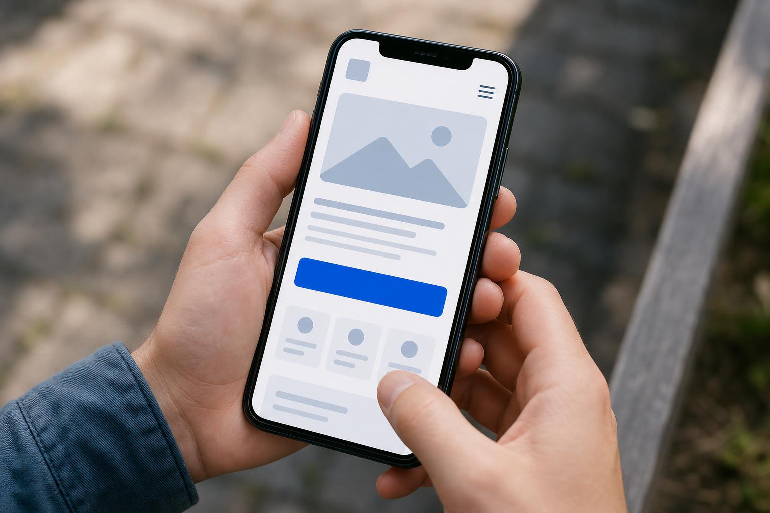
A study commissioned by Google and conducted by 55 and Deloitte Digital measured what happened when 37 brand sites improved load speed by just 0.1 seconds. Retail conversions rose 8.4%, travel conversions rose 10.1%, and — the number most relevant to a lead-generating small business site — form submission pages improved by 21.6%, based on hour-by-hour monitoring of 30 million mobile sessions.2
That's a tenth of a second, not a full redesign. Most small business sites have never had their real mobile load time measured on the specific page traffic actually lands on first.
3. Mobile-Friendly Design With Visible Contact Info
In a Google-commissioned survey of 3,000 US smartphone users conducted by Ipsos, 70% said they had used the "call" button directly from a mobile search result, and 61% said click-to-call mattered most in the purchase phase of shopping.3 The study is now over a decade old, but the behavior it measured, tapping a number instead of typing one, hasn't gotten less common as mobile browsing has grown.
A phone number that requires pinching to zoom, or that isn't a tap-to-call link at all, adds friction at the exact moment a visitor is ready to act. Keep the phone number, address, and a primary action visible without scrolling.
4. Real Trust Signals, Not Decorative Badges
Baymard Institute surveyed 2,510 US adults on which security seals they actually recognize and trust. Among the 1,286 who picked one, Norton led at roughly 36%, followed by McAfee at 23%, with TRUSTe and BBB Accredited tied around 13% each — but 49% of all respondents said they didn't know or had no preference at all.4
The honest takeaway isn't "add more badges." Trust signals only work when they're specific and recognizable, not generic. A vague "secure checkout" icon nobody recognizes does less than an actual, verifiable credential: a real BBB rating, a licensing number, or a years-in-business detail a visitor can independently check. For the fuller research picture on how trust and design quality translate into measured conversion lift, see how design quality affects ad and landing page conversion rates.
5. Genuine Reviews and Social Proof
97% of consumers read online reviews before choosing a local business, per BrightLocal's 2026 Local Consumer Review Survey of 1,002 US adults — and 54% go on to visit that business's website specifically after reading a positive review elsewhere.5 The second number is what matters for site design: a meaningful share of traffic arrives already primed to trust you, and a thin or generic site can undo that goodwill on arrival.

Reviews, testimonials, and case studies work best when they're specific: a named client, a real result, a photo, not a stock quote that could belong to any business in any industry.
6. Simple, Visible Navigation
Nielsen Norman Group tested navigation on 6 websites with 179 participants across desktop and mobile. Hiding the main navigation behind a hamburger icon, instead of showing it or using a hybrid "combo" approach, cut content discoverability by more than 20%, made desktop tasks at least 39% slower, and raised task-difficulty ratings by 21%.6
Hiding navigation to make a site look cleaner works against the actual goal: a visitor who can't quickly find your services or contact page doesn't stick around to search for it. Visible, or at minimum combo-style, navigation beat fully hidden menus on every metric the study measured.
7. Short Forms With Minimal Friction
Baymard Institute's checkout research, drawn from over 850 checkout-flow audits and studies involving nearly 12,000 participants, found the average US checkout displays 23.48 form elements by default, only 14.88 of them actual input fields. The best-performing flows cut that to as little as 12 — a 20-60% reduction, typically achievable without losing information the business actually needs.7
How a form behaves matters almost as much as its length. In a usability study by Etre, 22 participants using real-time inline validation, meaning errors get flagged as you type instead of only after you hit submit, finished 22% more successfully and completed forms 42% faster than with a traditional submit-then-review form.8 The sample was small, and the researchers called the results indicative rather than definitive, but the direction matches what shorter, clearer forms do everywhere else: less friction, more completions. Every field beyond name, contact info, and one qualifying question is a chance to abandon.
8. Clear Visual Hierarchy and White Space
A page with no visual hierarchy asks a visitor to figure out what matters most on their own, and most won't bother. Eye-tracking research from the Poynter Institute's Eyetrack studies found larger type draws scanning behavior while smaller type invites focused reading, and readers engage with shorter paragraphs roughly twice as often as long, dense blocks of text.9
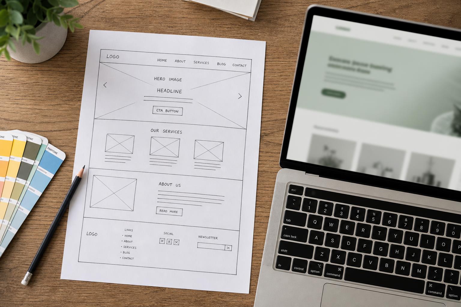
Practically: one clear headline size, one accent color reserved for the action you want taken, and enough space around each section that the page doesn't read as a wall of competing elements. If everything is emphasized, nothing is.
9. Readable Typography
Baymard Institute's readability research recommends keeping text lines to roughly 80 characters or fewer and setting line height, the vertical space between lines, to at least 1.5 times the font size.10 Wider lines are measurably harder to track with the eye and read as more intimidating before a visitor even starts.
This is one of the cheapest fixes on this list, a CSS change rather than a redesign, and it directly affects whether the value proposition from item 1 actually gets read instead of skimmed and abandoned. Typography choices are also a brand-consistency issue, not just a readability one — see brand consistency across Google, social, and your website for keeping type and color decisions the same everywhere a visitor encounters your business.
10. Accessible Color Contrast
WebAIM's 2026 audit of 1 million home pages found low-contrast text, meaning text-to-background contrast below the WCAG 2 AA accessibility standard, on 83.9% of home pages, up from 79.1% the year before, averaging 34 separate instances per page.11 Low contrast is the single most common accessibility failure WebAIM tracks, and it fails every visitor equally, not just the subset with a diagnosed vision impairment: light gray text on white is hard to read in direct sunlight on a phone screen regardless of who's looking at it.
The WCAG AA thresholds are specific and easy to check: at least 4.5:1 contrast for normal body text, and at least 3:1 for large text and interface elements like buttons.
Unique insight: items 4, 5, and 10 are all doing the same underlying job through different mechanisms. Trust badges, reviews, and legible text all exist to answer one silent visitor question before they'll act: "can I actually trust what I'm looking at?" A site that nails page speed and navigation but fails all three of those trust checks still won't convert, because speed gets someone to the page — trust is what gets them to act once they're there.
| # | Element | Key Finding | Fastest Fix |
|---|---|---|---|
| 1 | Above-the-fold clarity | Stay-or-leave decision made in 10-20 seconds1 | Headline + subhead answer "what, who, what next" with no scroll |
| 2 | Page load speed | 0.1s faster lifted lead-gen form submits 21.6%2 | Test real mobile load time on the actual landing page |
| 3 | Mobile + contact info | 70% of mobile searchers use click-to-call3 | Tap-to-call number visible without scrolling |
| 4 | Trust signals | 49% don't recognize generic security badges4 | Use specific, verifiable credentials, not vague icons |
| 5 | Reviews/social proof | 54% visit the site after a positive review elsewhere5 | Named, specific testimonials over generic quotes |
| 6 | Navigation | Hidden menus cut discoverability 20%+6 | Keep navigation visible, avoid hamburger-only menus |
| 7 | Form length | Best forms use ~12 elements vs. 23.48 average7 | Cut every non-essential field; add inline validation |
| 8 | Visual hierarchy | Shorter paragraphs read ~2x more often9 | One accent color per action, generous spacing |
| 9 | Typography | Lines under ~80 characters read easier10 | Constrain text column width; 1.5x line height |
| 10 | Color contrast | 83.9% of home pages fail WCAG AA contrast11 | 4.5:1 contrast for body text, 3:1 for large text/UI |
Frequently Asked Questions
What's the single most important website design element for conversion?
There isn't one — they compound. A fast page with no clear value proposition still loses visitors, and a beautifully designed page that loads slowly loses them before they see it.1,2 If forced to prioritize, fix page speed and above-the-fold clarity first, since both affect every visitor before anything else on this list gets a chance to matter.
Does website design actually affect conversion rate, or is that overstated?
The research says it's real and measurable, not a matter of taste. A 0.1-second speed improvement lifted lead-generation form submissions by 21.6% in a Google-commissioned study, and hiding navigation behind a hamburger menu cut content discoverability by more than 20% in controlled testing.2,6 These are behavioral outcomes from real testing, not design opinions.
How short should a contact or lead form actually be?
As short as the business can make it while still getting what it needs for a first touch. Baymard's checkout research found best-performing forms use around 12 elements versus a 23.48-element average, a 20-60% reduction usually achievable without losing meaningful information.7 For most lead forms, name, contact info, and one qualifying question is enough.
Do I need a designer to fix these, or can I do it myself?
Several of these are genuinely low-cost fixes: line length, line height, and contrast are CSS-level changes, not a rebuild. Others, like navigation structure and above-the-fold messaging, benefit from someone who can look at the page the way a first-time visitor does. DIY branding vs. hiring a designer covers that tradeoff in more detail.
Key Takeaways and Next Steps
None of these 10 fixes require a full redesign to start. The fastest wins are usually the cheapest: check your real mobile load time on the page traffic actually lands on, count the fields on your lead form, and run your body text through a contrast checker. The slower wins, above-the-fold clarity and navigation structure, are worth a closer look once the quick fixes are done. If you want a second set of eyes on where your site is losing visitors, talk to our team.
Want more like this in your inbox?
Occasional, practical marketing advice for local service businesses. No spam.
References (11)
- 1.Nielsen Norman Group — How Long Do Users Stay on Web Pages?, analysis of 205,873 pages and 2+ billion dwell-time measurements (Microsoft Research / Chrome/IE plug-in data)
- 2.web.dev (Google) / Deloitte Digital — Milliseconds Make Millions, 37 brand sites, 30M+ mobile sessions, conducted by 55 and Deloitte Digital, late 2019
- 3.Google (AdWords/Inside AdWords blog) — Study conducted by Ipsos on behalf of Google, n=3,000 US smartphone users, Sept 2013 (dated but still widely referenced)
- 4.Baymard Institute — Which Site Seal Do People Trust the Most?, Google Consumer Surveys, n=2,510 (1,286 seal selections), Jan 2013
- 5.BrightLocal — Local Consumer Review Survey 2026, n=1,002 US adult consumers, SurveyMonkey panel
- 6.Nielsen Norman Group — Hamburger Menus and Hidden Navigation Hurt UX Metrics, with WhatUsersDo, n=179 participants across 6 sites, desktop + mobile
- 7.Baymard Institute — E-Commerce Checkout Usability Report & Benchmark, 850+ checkout steps audited, 9 quantitative studies, 11,777 total participants
- 8.A List Apart (Luke Wroblewski / Etre) — Inline Validation in Web Forms, Etre usability study, n=22 participants, 6 form variants, 2009
- 9.Poynter Institute — Eyetrack07 eye-tracking research on online and print reading behavior, 2006-2007
- 10.Baymard Institute — Readability: The Optimal Line Length
- 11.WebAIM — The WebAIM Million 2026, accessibility analysis of 1,000,000 home pages via WAVE API, Feb 2026

Written by
Yash · Creative Specialist
Builds the creative and content that gets your business noticed.